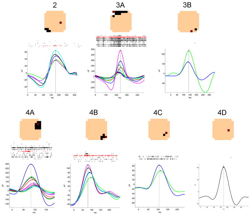
Figure 2. Summary of the seven microdischarge populations.
A typical microdischarge from each population is shown, with each μEEG trace representing one channel in the discharge field. Waveforms in which the maximum deflection was negative are shown inverted. The timing of the peak value in each channel is shown marked with an asterisk; a vertical line is drawn through the peak in the reference channel, indicating the time used for alignment of the selected discharges. A raster plot of single neuron detections from all the discharges included in each sample is displayed above the EEG traces. At the top are layout schematics showing the field of each population, as in Figure 1. The primary channel is shown in red in both the layout schematic and the raster plots.

