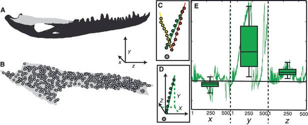
Fig. 3.

Diagram describing how variation in the displacement was calculated. (a) Diagram of the entire working side mandible with the working side surangular in light gray. The global coordinate system is defined in the lower right portion of this image. (b) Diagram of the working side surangular with all 500 sub-sampled nodes superimposed over the image. (c) Diagram showing 30 displaced positions of a single node (colored circles) relative to the undeformed position of that node (gray circle). The three colors in this plot correspond to the three sets, each of 10 trials. The colored lines represent the vectors describing principal component one from the total least squares regression on the data in each set. (d) Diagram showing a point cloud representing the 10 displaced positions of a single set (green circles) relative to the undisplaced position of the node (gray circle). The solid green line represents the vector describing principal component one from the total least squares regression on the data in this set. The black arrows represent the orientation of the global coordinate system. The green dotted lines show how the vector can be described by the axes of the global coordinate system. (e) Diagram of a line plot (green line) representing the contribution of each axis to the unit vector describing the orientation of the total least squares vector from principal component one at each of the 500 sub-sampled nodes. The box plots superimposed over the line plot represent the mean and standard deviation associated with each axis.
