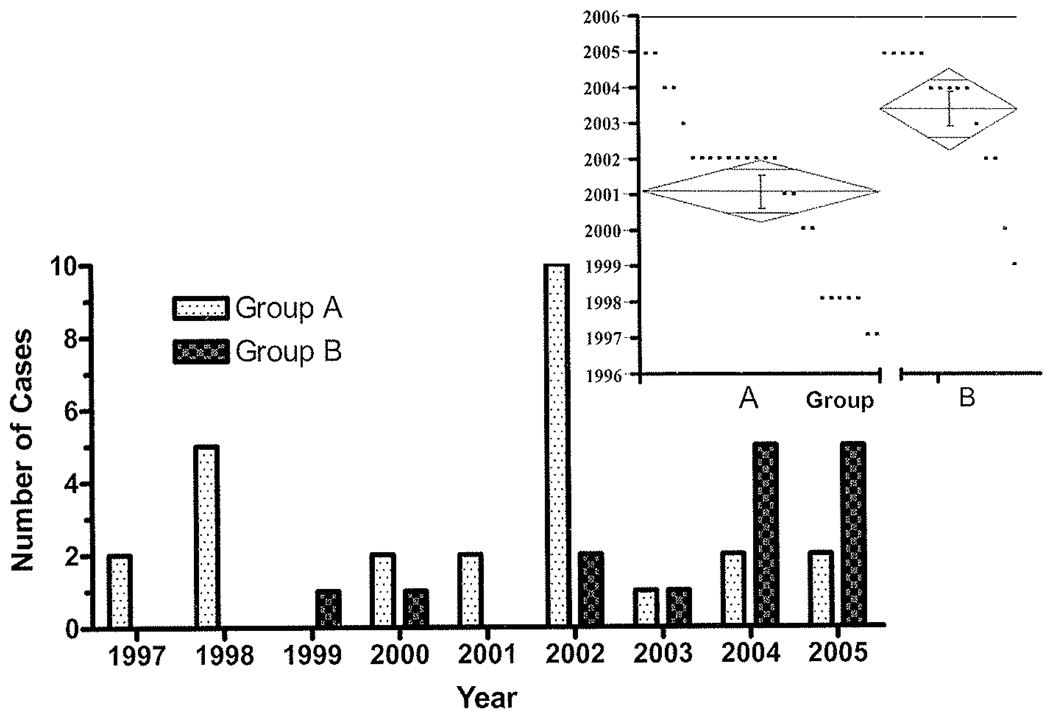
FIG. 2.
Bar graph showing the distribution of cases according to operative date. The Group B patients occur more frequently later in the study than Group A patients. The inset demonstrates results of the 1-way ANOVA of Group A (left) compared with Group B (right). Individual points within the graph represent individual cases according to year. The diamond shape represents the mean (center line) and the points of the diamond represent the 95% CIs. The 26 Group A cases occurred primarily in 2001 (95% CI 2000–2002), and the Group B cases in 2003 (95% CI 2002–2004), a statistically significant difference (p = 0.0022).

