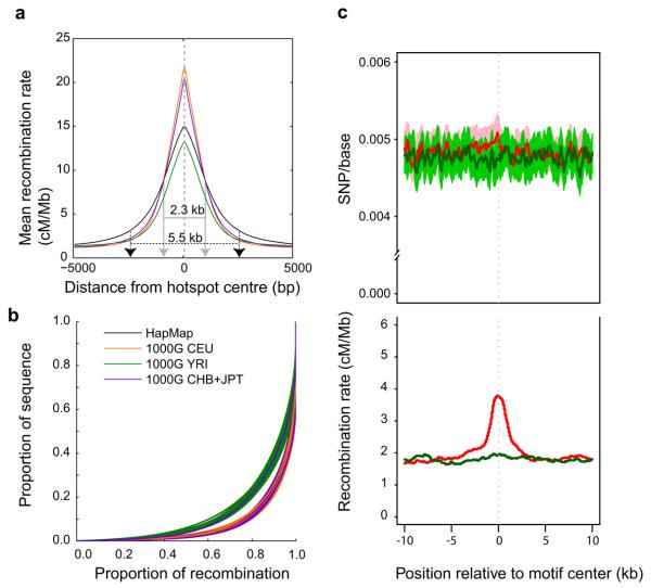
Figure 6. Recombination.
a, Improved resolution of hotspot boundaries. The average recombination rate estimated from low coverage project data around recombination hotspots detected in HapMap II. Recombination hotspots were narrower, and in CEU (orange) and CHB+JPT (purple) more intense than previously estimated. b, The concentration of recombination in a small fraction of the genome, one line per chromosome. If recombination were uniformly distributed throughout the genome, then the lines on this figure would appear along the diagonal. Instead, most recombination occurs in a small fraction of the genome. Recombination rates in YRI (green) appeared to be less concentrated in recombination hotspots than CEU (orange) or CHB+JPT (purple). HapMap II estimates are shown in black. c, The relationship between genetic variation and recombination rates in the YRI population. The top plot shows average levels of diversity, measured as mean number of segregating sites per base, surrounding occurrences of the previously described hotspot motif 43 (CCTCCCTNNCCAC, red line) and a closely related, but not recombinogenic DNA sequence (CTTCCCTNNCCAC, green line). The lighter red and green shaded areas give 95% confidence intervals on diversity levels. The bottom plot shows estimated mean recombination rates surrounding motif occurrences, with colours defined as in the top plot.

