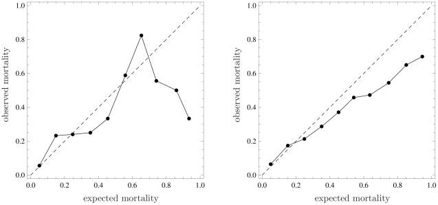
Figure 1. Calibration plots through representation of observed mortality versus expected mortality (bisector, dashed line).
Left panel: Data of 194 patients staying longer than 24 hours in a single Intensive Care Unit (ICU) taking part in GiViTI (Italian Group for the Evaluation of Interventions in Intensive Care Medicine) in 2008; expected mortality calculated with a prediction model developed by GiViTI in 2008. Right panel: Data of 2644 critically ill patients admitted to 103 ICUs in Italy from January to March 2007; expected mortality calculated with SAPS II.

