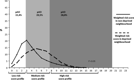
Fig. 1.
Distribution of individual weighted risk scores for women residing within and outside of a deprived neighbourhood. The graph represents the distribution of individual weighted risk scores between deprived and non-deprived neighbourhoods. Differences in weighted risk score profiles were tested using Mann–Whitney U test. The risk for the compound measure ‘Adverse Outcome’ is represented by ‘pAo’ given as percentage per risk stratum. Analyses are based on multiple imputed dataset, N = 7,359

