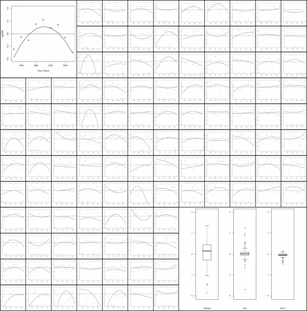
Figure 1.
First plot: dots indicate annual log standardised mortality rates for Manhiça district, while the smoothed line is the estimated second-order polynomial time trend derived from the Poisson regression model. The same information is shown in subsequent plots per each of the 115 neighbourhoods that comprise Manhiça. Last plot: boxplots showing the variability among the 115 intercept, first- and second-order polynomial estimates derived from the 115 neighbourhood-specific Poisson regression models.

