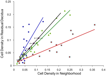
Figure 11. Quantile - quantile plot for neighborhood 10 µm.
The dots (red: CXCR3+ cells in relation to endothelium, green: CD56+ cells in relation to endothelium, blue: CD56+ cells in relation to the tunica media of spiral arteries) represent the medians of patients' data of cell densities in the neighborhood (x-axis) versus in the residual decidua (y-axis). The black line represents the random distribution, the black bars the standard deviation of the random distribution.

