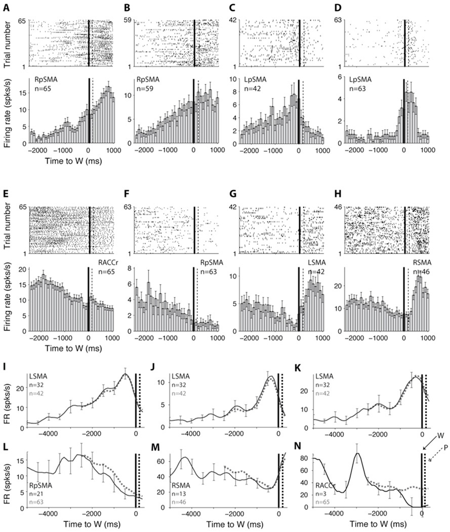
Fig. 3.
A–H. Examples of response profiles. (A–D) Neurons increasing their firing rates prior to W (p < 10−5, 10−5, 10−7, and 10−5 respectively). (E–F) Neurons decreasing their firing rates prior to W (p < 10−5, 10−4 respectively). (G–H) Neurons decreasing their firing rate prior to W and then increasing their firing rates around W (p < 10−3, 10−5 respectively). The conventions are as in Fig. 2E–F.
(I–N). Examples of responses from several units that started to change their firing rate before the baseline period used in the text (−2500 to −1500 ms with respect to W). The responses are aligned to W (vertical black line); the vertical dashed line denotes the mean P. Only those trials where W occurred more than 5000 ms after the first turn of the clock are shown in the black trace. The dotted red trace shows all trials starting from 2500 ms before W (the black curve and the red curve do not overlap perfectly because there are more trials averaged in the red curve; the number of trials is indicated on the left of each subplot). The location of each unit is indicated in each subplot. Error bars denote SEM and are shown only every 500 ms.

