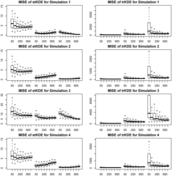
Figure 1. Grouped box plots of MISE for simulations of stKDE and trKDE.
Box-whisker plots of MISE for different sample sizes and factor levels of ordered variable were grouped together for a clear comparison. The middle bold band inside the box is the 50th percentiles or median; the bottom and top of the box are the 25th and 75th percentiles, that is, the lower and upper quartiles, respectively. The whiskers in the bottom and top are the values of 1.5 inter-quartile range (IQR) times the lower and upper quartiles. The y-axis represents the MISE and the x-axis is the sample sizes for three different levels of ordered time variable, which are 2, 4 and 6 levels in turn from left to right.

