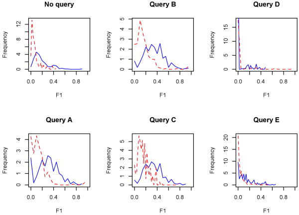
Figure 10.
Frequency curves of the full graph (‘No query’) and the five test queries, stratified by the median of the query result size; the blue, solid line represents the half of queries whose number of results rested above the median, and the red, dotted line those which fell below. For these plots, the (protein-level) measure is used as the x-axes (note the differences in scale for the y-axes). Differences between distributions per query are statistically significant by permutation test (p ≤ 0.001), save Query D.

