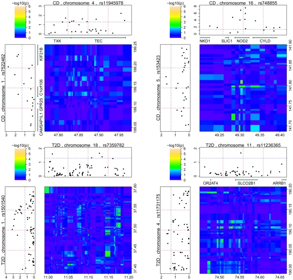
Figure 2. Regional signal plots of the interactions observed in validation datasets.
The signal plots of three interactions for CD and two interactions for T2D are shown. The interactions were observed in the IBDGC non-Jewish population data and the GENEVA Diabetes Study data, respectively. The format of this figure is similar to that described in Figure 1; the red dotted lines and the red dot in the middle indicate the positions of the originally identified SNP pair. Two other red dotted lines for each single-locus signal plot and the red box in the interaction signal plot were added to indicate the regions used for the local validation tests; the blue dotted lines indicate the p-value thresholds of 0.05. (The interaction between rs7522462 and rs11945978 was replicated by proxy SNPs; therefore, its local validation was disregarded).

