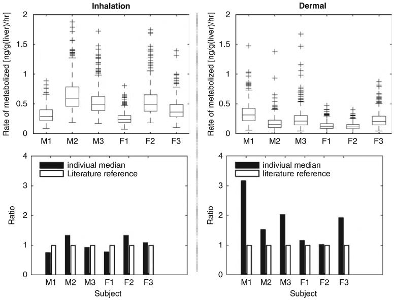
Figure 6.

Right column present the predictions of the hepatic rate of metabolism for inhalation scenario; and results for dermal scenario are on the left column. For each scenario, the upper figure presents the boxplots of average rate of chloroform metabolized in liver (ng/g/h) for 24 h. The box has lines at the lower quartile, median, and upper quartile values. The whiskers are lines extending from each end of the box to show the extent of the rest of the data. Lower figure compares the location of the 50th percentile (50%) (as shown in the upper figure) to those calculated using default literature reference values.
