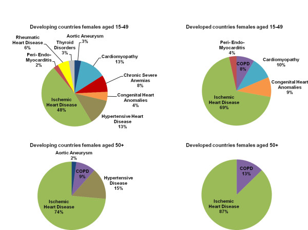
Figure 1.
Redistribution proportions by target group, females. This series of pie charts displays the target groups, or underlying causes, for females by age and country development group that heart failure-attributed deaths are redistributed to and the proportion that each target group receives, as predicted by the regression model.

