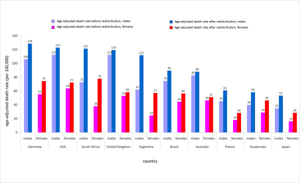
Figure 3.
Age-adjusted death rates (per 100,000) in 2005 for ischemic heart disease before and after heart failure redistribution, by country. This graph shows the increase in age-adjusted death rates for ischemic heart disease for males and females in a series of 10 countries after redistribution of heart failure using the redistribution proportions predicted by the regression model, described in the preceding pie charts.

