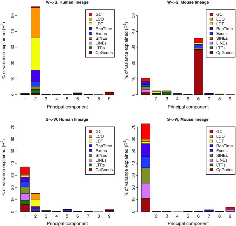
FIG. 2.—
Principal component regression for W→S substitution rates (top row) and S→W substitution rates (bottom row) in the human (left column) and the mouse (right column) lineages. The height of each bar represents how much of the variable’s variance the corresponding component explains. Each colored area is proportional to the relative importance of the corresponding factor inside a component.

