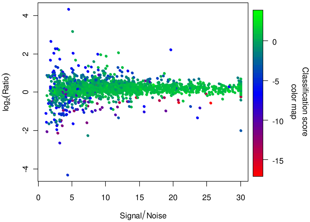
Figure 4.
Scatter plot of the logarithm of peptide ratios versus S/N for the mouse data. The color of each point is determined by its SVM classification score. The proportion of good spectra (positive scores, green colors) is higher among spectra with higher S/N, though some of the latter are correctly classified as bad (negative scores, blue and red colors) based on other spectral features.

