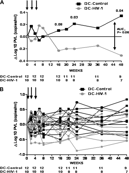
Figure 1.
Change in plasma viral load from baseline during the study period. A, Median values. B, Individual values. Arrows represent vaccinations. Numbers at bottom represent patients at risk. P values of Mann-Whitney U test are shown at weeks 16, 24, and 48. P value of area under the curve (AUC) is also shown.

