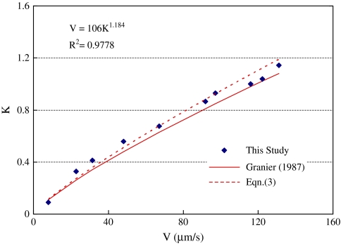
Fig. 3.
Calibration curve of the sap flow sensor. The symbols are measured data, the solid line is the original curve of Granier (1987), and the dashed line is the prediction of Eqn (3) with new calibration constants. (This figure is available in colour at JXB online.)

