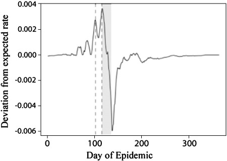
Fig. 4.
Between-household infection efficiency. The curve shows the deviation from expected rate of new infections (based on the regression on the number in the preceding infectious period). Vertical dashed lines show the beginning and end of the school summer break, and the gray area is the same period offset by the mean lag time for viral incubation shown in Fig. 1. The sharp drop in infection rates within this shaded region corresponding to the school break. The onset of the rains much later (c. day 200).

