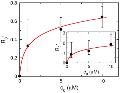
Figure 9. The response amplitude  vs. serine concentration
 .
.
The solid circles are experimental data and the line is the theoretical expression  , where
  are extracted from Figs. 8(A to C). The fitting procedure yields
  and
and  . The curve in the inset is generated from the best fit values
  in Fig. 8, and the data can be explained by
  and
and  , which is plotted as a solid line.

