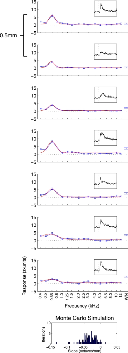
Fig. 2.
Responses from a tuned penetration. Average response over a 200-ms period following baseline (normalized by subtracting the mean and dividing by the SD of the activity during the baseline period) is plotted in blue as a function of sound frequency (i.e., isointensity frequency response curves). Error bars indicate SE. Topmost panel shows the shallowest recording in this penetration, with each panel thereafter being 0.5 mm deeper. A Gaussian curve (red line) was fit to data from tone trials. Location of the peak of this curve was labeled as best frequency (BF), which remained low throughout this penetration. At the extreme right, the average and SE of responses to presentations of broadband white noise are shown. Insets: peristimulus time histogram (PSTH) across stimuli for a period ranging from 50 ms before to 200 ms after stimulus onset. Below the tuning data, results from a Monte Carlo analysis to probe for tonotopy indicate that this penetration did not show an increase in BF with deeper recordings: the slopes are not biased towards positive values. WN, white noise.

