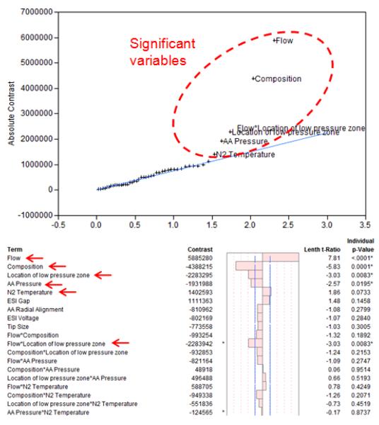
Figure 4.
Example of half normal probability plot generated by JMP (top of figure) compares and orders the estimated effects of the variables (vertical axis) with a normal quantile distribution assuming variables have no effect on the measured abundance (horizontal axis). Consequently variables on the right that are away from the normal quantile curve are considered to have a significant effect. Their calculated t-ratios and p-values (testing the probability to obtain these results assuming the variable has no effect) also confirm the significance of these variables.

