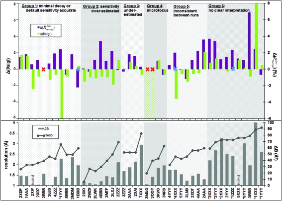
Figure 2.
Discrepancies between actual and predicted dataset quality for the 43 datasets, juxtaposed with crystal properties. Datasets are ordered and labelled as in Fig. 1 ▶, and the plots are shaded to correspond to the six groups from that figure; within each group datasets are sorted by increasing resolution. Crystal properties are plotted in the lower panel: connected dots indicate dataset resolution and bars indicate anisotropy [ΔB of the final dataset as reported by PHASER; cubic crystals (indicated) are fully isotropic]. The upper panel plots the differences in the quality metrics (colours in the legend), with positive and negative corresponding, respectively, to over-optimistic and over-pessimistic estimates from BEST. The blue crosses indicate datasets where autoindexing failed, but which succeeded when restarted manually. The red crosses indicate where BEST prediction failed; the hatched columns (3MAO and 3OOY) represent very severe underestimates of the data in the outer shell (R meas > 100%).

