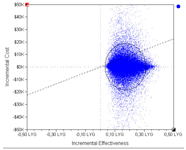
Figure 2.
Incremental cost-effectiveness scatter plot of "Hypertension Programme" versus "Usual care". Each blue dot represents the result of an iteration (a set of sampled variables) out of 100,000. The black circle represents the 95% confidence interval of results. The dashed diagonal shows the willingness-to-pay threshold of 45,000 Int$/LYG. Dotted lines mark 0 values for each axis. Incremental costs expressed per 1,000 (K) international dollars. Incremental effectiveness expressed in life years gained (LYG).

