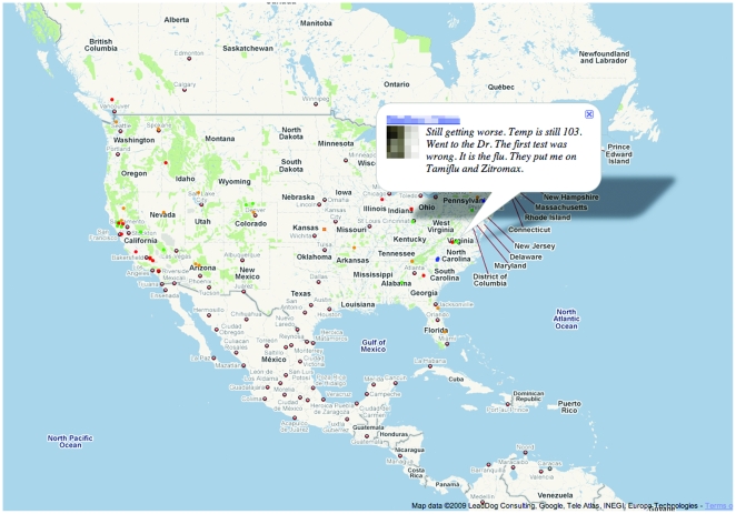
Figure 1. Influenza-Related Twitter Map.
Color-coded dots represent tweets issued by users (shown at the users' self-declared home location). Hovering over the dot displays the content of the tweet; here, the user name is intentionally obscured. A client-side JavaScript application updates the map in near-real time, showing the 500 most recent tweets matching the preselected influenza-related keywords.

