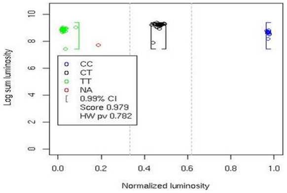
Figure 2. Graphical plot of data clustering.
Data representation is given as a plot of sum of luminosity on a log scale as a function of the normalized luminosity for a C/T SNP genotyped in 91 individuals. The X axis represents the normalized intensity ϕ, whereas the Y axis represents the sum of the mean intensities of both probes, on a log scale. Each point represents an individual genotype and points are clustered in three groups based on genotype: CC (blue); CT (black); TT (green); no-calls are shown in red. The brackets represent the confidence interval boundaries for a type 1 error of 0.01. The silhouette score (0.979) and HWE p-value (0.782) are also reported.

