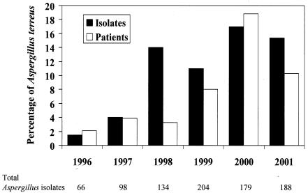
FIG. 1.
Graph depicting the frequency of isolation of A. terreus isolates relative to that of all Aspergillus species during the study period (black bars) and the percentage of patients with A. terreus isolates relative to the total number of patients with Aspergillus species (white bars). Total numbers of Aspergillus isolates are listed below the x axis. The y axis represents percentages of A. terreus isolates or patients.

