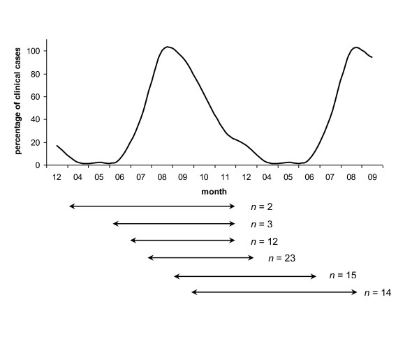
Figure 1.
Period of time during which we included municipalities that reported their first clinical BTV-8 case. The curve represents the distribution of the clinical cases reported per month over 2007-2008, expressed in percentage compared to the month with the highest number of cases, i.e., August. The percentage of clinical cases represented on the vertical axis was thus 100% in August. The horizontal lines under the graph symbolize the time period during which we included the municipalities that reported their first clinical case of BT, in relation to the month of report of the first clinical case in the department. All observed situations are plotted. n represents the number of departments. For example, the first horizontal line means that for the two departments that reported their first clinical case in April, we included in our dataset the departments' municipalities that reported their first clinical case from April to November (included).

