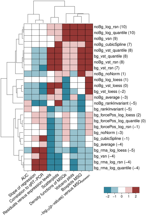
Figure 1.
Heatmap of quality scores assigned for the different pre-processing methods. Displayed are the quality scores for the different pre-processing methods given for the analyses conducted. Quality scores range from -2 (bad) to 2 (good). The values in parentheses display the sum over the single quality scores for the respective pre-processing procedures. Based on this sum, the pre-processing method finally used to normalize the Phenocopy data has been chosen. Manhattan distance and complete linkage were used for clustering by applying an adjusted heatmap.2() function as implemented in the gplots package [36]. Methods evaluating the bias (slope of regression, correlation to qRT-PCR) are clearly separated from methods evaluating the variance. Pre-processing procedures that perform best based on the sum over quality scores are located at the top of the heatmap.

