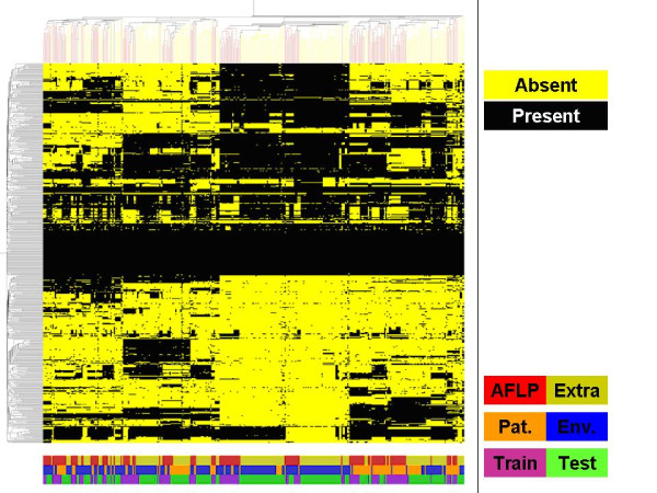
Figure 3.
Genomic diversity based on hierarchical clustering analysis. Hierarchical clustering analysis was performed on all 346 genomic datasets generated in this study. Data were clustered both in columns (representing datasets) and rows (representing 480 spots on the array) with Pearson correlation distances and average linkage. Binarized data were used for this analysis. Yellow represents absence of signal, black represents presence of signal. The color-coded bars on the bottom show the distribution of the strains used for AFLP analysis as shown in Figure 1 (red) and the additional strains (yellow-green), the distribution of patient (orange) and environmental (blue) strains and the distribution of training (purple) and test (green) set strains. In all cases the random distribution of the groups is clearly visible.

