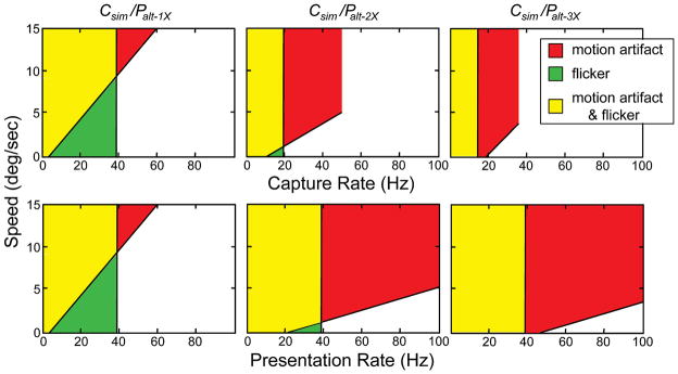
FIGURE 12.
Summary of motion artifact and flicker data. The upper row summarizes the data when plotted with respect to capture rate and the lower row the same data when plotted with respect to presentation rate. The columns summarize the data from different protocols. The red regions represent combinations of stimulus speed and temporal rate that produced visible motion artifacts. The green regions represent combinations that produced visible flicker. The yellow regions represent combinations of speed and rate that produced both. The unshaded regions represent combinations that yielded smooth apparent motion without flicker. The colored regions in the middle and right panels of the upper row are clipped because we did not present capture rates greater than 50 and 33 Hz, respectively, with those protocols.

