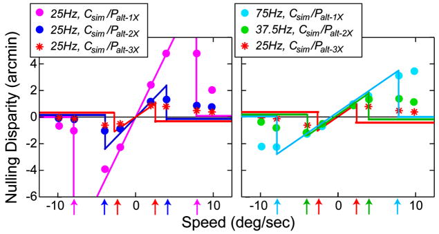
FIGURE 26.
Predicted and observed distortions with simultaneous capture and alternating presentation. Nulling disparity is plotted as a function of stimulus speed. The colored symbols are the data from Fig. 22. The predictions are represented by the colored lines. They are given by Eq. (12) until the temporal disparity-gradient limit is exceeded and then the predictions become the disparities with the lower disparity gradient. The arrows indicate the speeds at which the critical limit occurs. The left panel shows the predictions and data from protocols with a 25-Hz capture rate. The right panel shows the predictions and data from the same protocols, but with different capture rates.

