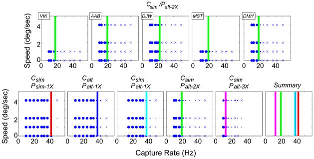
FIGURE 6.
Data and fits for all conditions in Experiment 1. Each panel plots the proportion of trials in which flicker was reported as a function of capture rate and stimulus speed. The proportion is indicated by the size of the data symbol. ×’s represent conditions in which flicker was never reported. The panels in the upper row show the data from the Csim/Palt–2X protocol for all five observers. The lower row shows the data averaged across observers for each protocol. We fit cumulative Gaussians to each observer’s data for each condition; the 0.5 point on each fitted function was the estimate of flicker threshold. Those thresholds across conditions were generally aligned vertically in plots like this figure (meaning that they were the same capture rate independent of speed). The color lines in each panel of the top row illustrate the similarity of our results across observers. To summarize the data, in the bottom row we averaged the raw data across observers and fit the vertical lines to the averaged data. The sixth panel in the bottom row plots the lines from the first five panels.

