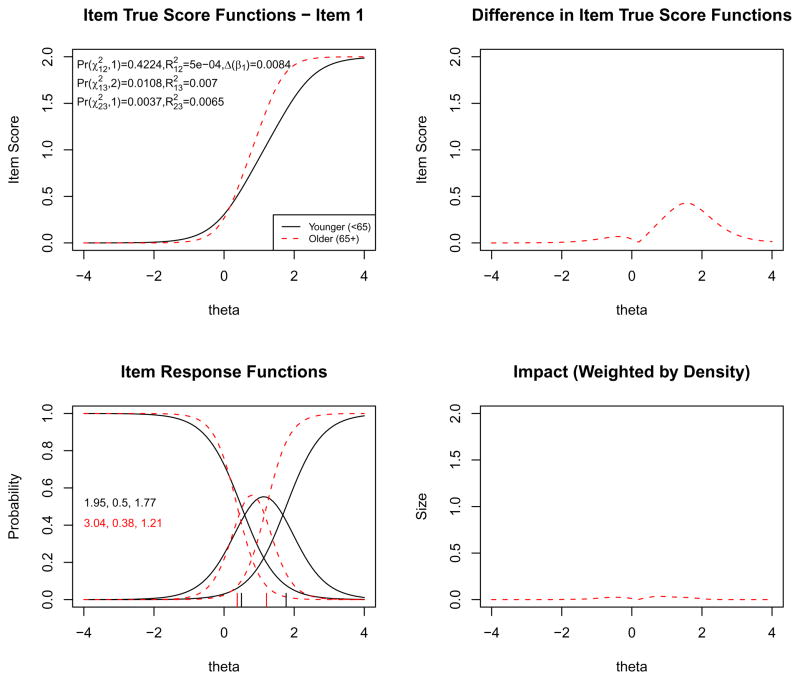
Figure 2.
Graphical display of the item “I felt fearful” which shows non–uniform DIF with respect to age. Note: This item retained three response categories (0, 1, and 2) from the original five–point rating scale after collapsing the top three response categories due to sparseness. The program by default uses a minimum of five cases per cell (the user can specify a different minimum) in order to retain each response category. The upper–left graph shows the item characteristic curves (ICCs) for the item for older (dashed curve) vs. younger (solid curve). The upper–right graph shows the absolute difference between the ICCs for the two groups, indicating that the difference is mainly at high levels of anxiety (theta). The lower–left graph shows the item response functions for the two groups based on the demographic–specific item parameter estimates (slope and category threshold values by group), which are also printed on the graph. The lower–right graph shows the absolute difference between the ICCs (the upper–right graph) weighted by the score distribution for the focal group, i.e., older individuals (dashed curve in Figure 1), indicating minimal impact. See text for more details.

