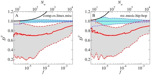
Figure 1. Relationship of frequency  to dissemination across users
  .
.
A, B, The results are shown for half-year windows centered on 1998-01-01 for the comp.os.linux.misc group (A) and the rec.music.hip-hop group (B). Red solid line: running median for all words with  . Red dashed lines:
  th and
  th percentiles for the same words. Blue dashed lines:
  th and
  th percentiles around the expected value of
  for randomly distributed words, determined by Monte Carlo simulations with
  independent shufflings of the text. Black line: analytically calculated ceiling
  (floor effects and the other ceiling,
  , do not pertain within the scale of the figure). The median empirical
  is systematically below the
  th percentile of the estimated random variation. The relationship of median
  to
to  is nearly flat up to
  .
.

