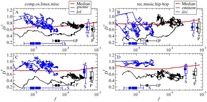
Figure 7. Dynamical behavior of P- and S-words in frequency and dissemination.
A, B, Relationship of  to frequency. Black and blue curves: evolution of example P-words and S-words over time. Red line: median over all words, as in Figure 2. Boxplots: distribution of the mean frequency
  (solid, horizontal), mean dissemination
  (solid, vertical), and mean dissemination
  in the rising period (open, vertical) for all P- and S-words (Tables S1, S2, S3, S4 in Supporting Information S1). The mean is calculated over all words with
  within the corresponding window. C, D, The
  -counterpart of panels A, B.

