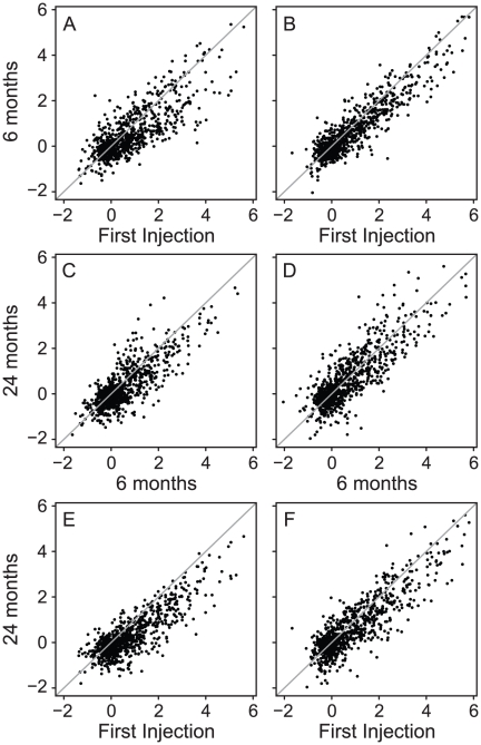
Figure 2. Scatter plots showing correlations between induction ratios between 3 time points over 24 months.
Panels (A), (C) and (E): 5 good responders showing the correlation between the initial injection and the 6-month injection (A); between the 6-month and 24-month injection (C); and between the initial and the 24-month injection (E). Panels (B), (D), (F): 5 poor responders at the same time points. Note the highly conserved IRG response over 24 months, both in the good and poor responders.

