
Figure 2.
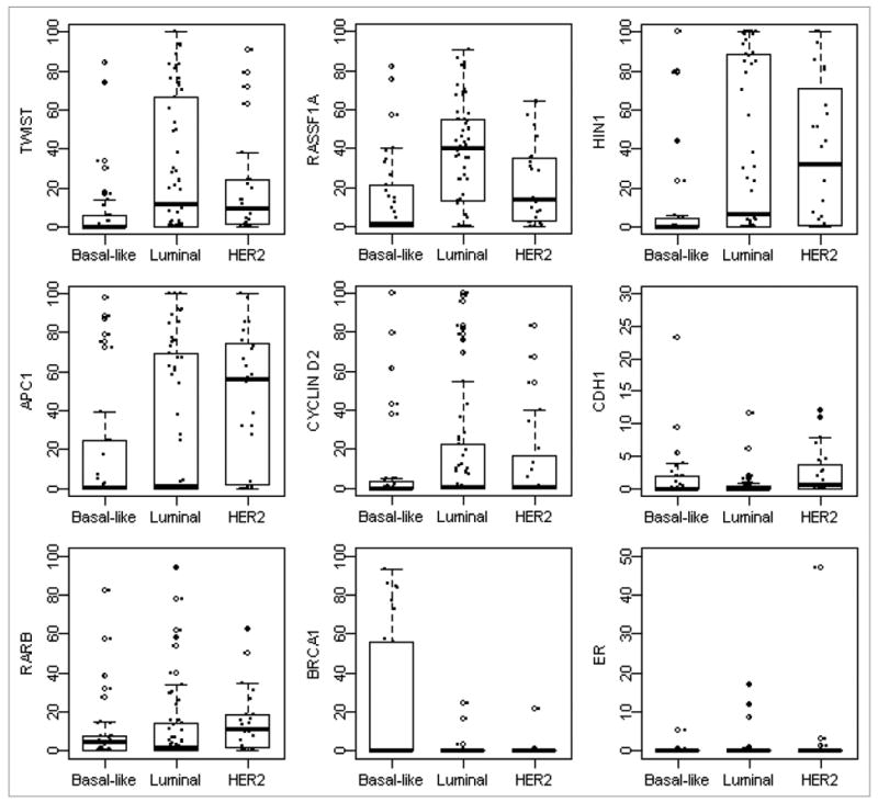
Distributions of gene methylation across subtypes. Box plots showed distribution of individual gene methylation across three subtypes. The box represents the middle 50% of the data. The ends of the box represent the 25th and 75th percentiles, the bars indicate the 10th and 90th percentiles, and a horizontal line inside the box shows the median. The open circles outside the box represent the extreme values and the solid circles represent the raw data.