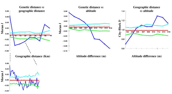
Figure 7.
Autocorrelation analysis. Results of the autocorrelation analysis using all 212 genotypes and all loci. The 99% probability envelopes are indicated: light blue, upper limit; green, lower limit. Dark blue, observed data: for genetic distance vs geographical distance). Inset: the first 20 km from panel a) (40 classes, 500 m each).

