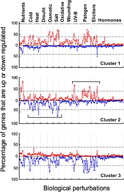
Figure 3.
Characteristics of the Three Different Clusters.
Clusters 1 to 3 are given in the top, middle, and bottom panels, respectively. The different cues are indicated on top. Red graphs and blue graphs represent the percentages of upregulated and downregulated genes, respectively, as indicated on the y axis in the left hand side. For each of the given cues, the individual diamond-shaped dots are ordered from left to right to include increasing time points of the same cue in shoots, followed by increasing time points of the same cue in roots.

