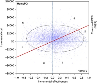
Figure 2.
The ICE scatter plot includes a single set of points representing pairs of incremental cost and effectiveness values from the simulation results (n=10 000) relative to a baseline (oral treatment at home; HomePO). The comparator in this scatter plot is IV treatment at home (HomeIV). The slope intersecting the y axis at $4000 displays the WTP threshold. In addition to the WTP line, a 95% confidence ellipse is drawn in the ICE scatter plot. The graph can be divided into several distinct regions: (1) HomeIV dominates HomePO (17%); (2) HomeIV is more costly and effective, and its ICER is less than or equal to the WTP, so it is cost effective (19%); (3) HomePO is more costly and effective, but its ICER is greater than the WTP, so HomeIV is optimal (4%); (4) HomeIV is more costly and effective, but its ICER is greater than the WTP, so HomePO is optimal (26%); (5) HomePO is more costly and effective, and its ICER is less than or equal to the WTP, so its optimal (6%); and (6) HomePO dominates HomeIV (28%).

