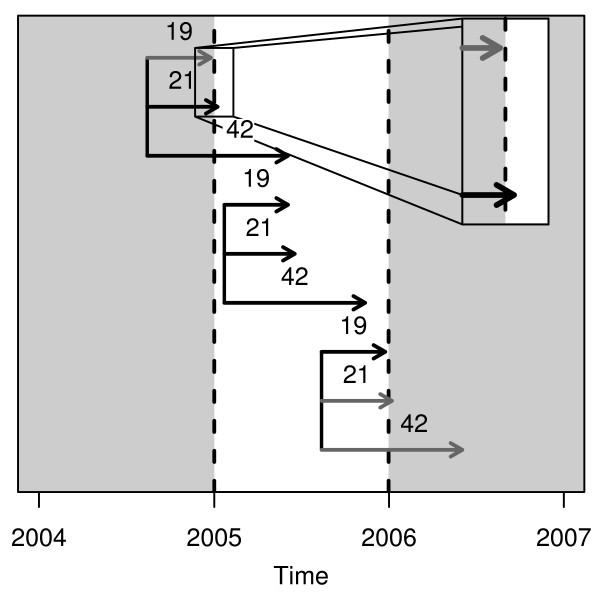
Figure 1.
How the population at-risk changes according to birth date using a birth cohort based on all births in 2005. Black arrows show births included in the cohort and grey arrows show births that were missed. The number above each arrow shows the gestation length in weeks. The plot shows three groups of three births, each group represents one conception date.

