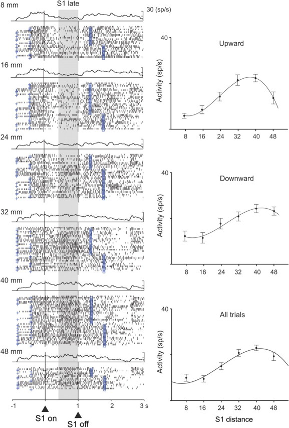
Figure 2.

Distance tuning during the S1 and D1 periods. PA neuron with a cubic relationship between the S1 distance and neural activity during the late S1 period. Each dot in the raster plot indicates when the cell discharged relative to S1 onset (triangle and vertical line); spike-density averages are above each display. The cross mark to the left of the alignment line on each raster line shows the onset of the prestimulus period (400–800 ms); the square mark to the right of the alignment line corresponds to the end of D1, which was either 400 or 800 ms after S1 offset. Trials were divided according to S1 distance (8–48 mm). Plots shown to the right show the mean discharge rate for each cell as a function of S1 distance, with regression curves shown for all trials (bottom) and separately for S1 up (top) and down (middle) from the reference point. Error bars indicate SEM. Background shading indicates the analyzed period. sp, Spikes.
