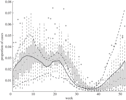
Figure 6.
Comparison of observed and model seasonal variation in measles incidence. The boxplots represent the week-by-week trend and variability in weekly case reports over the period 1940–1965, expressed as fractions of the total number of reports for the corresponding calendar year (i.e. all weekly case reports from 1940 were divided by the total number of case reports for all of 1940, and so on). The solid and dashed curves show the 25th, 50th and 75th percentiles (across years) of the same quantity in a forward solution of the deterministic model (2.1) starting from the estimated system state at the start of 1940.

