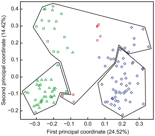
Figure 2. Principal Coordinate Analysis of microsatellite data.
The first two principal coordinate axes are shown that represent 24% and 14% of the variation. K-means groups are represented with polygons surrounding isolates from Pyr lakes (green triangles) and ponds (green squares), from HTM (red circles), and from LLaP (blue diamonds).

