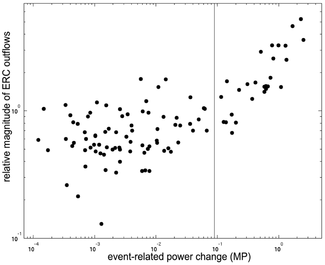
Fig. 12.
Comparison of values of event-related functional activation vs. causal interactions. X axis represents mean ECoG power changes in the frequency range 70–115 Hz (chosen to match the range used for ERC), for each site, and each task stage, as depicted in Figs. 9–11. Y axis represents mean magnitude of ERC outflows (70–115 Hz) from each site, for each task and stage (Figs. 9–11). Both X and Y axes are in logarithmic scale.

