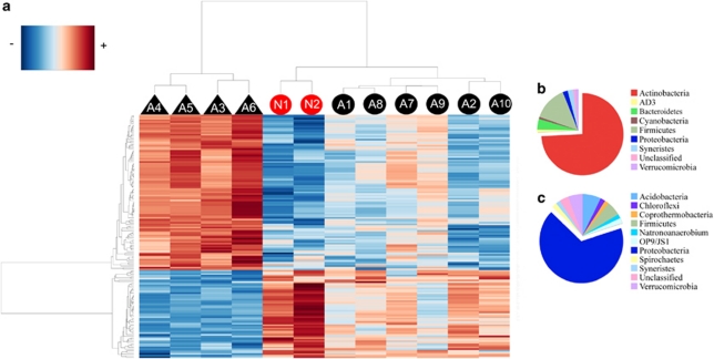
Figure 2.
Heatmap with bidirectional clustering, displaying the relationship between 12 patient samples and 152 significantly different taxa. (a) Negative or positive H. pylori-glmM status is annotated with triangles or circles, respectively. Non-Amerindians are represented in red and Amerindians in black. Bacterial taxa are clustered to the left and patient cluster appears at the top of the heatplot according to their intensity profile similarity. The relative abundance of the three Helicobacter taxa was not included in this analysis. Pie charts depicting phylum level distribution between bacterial taxa that inversely correlated (b; n=97) or co-correlated (c; n=55) with H. pylori positivity.

