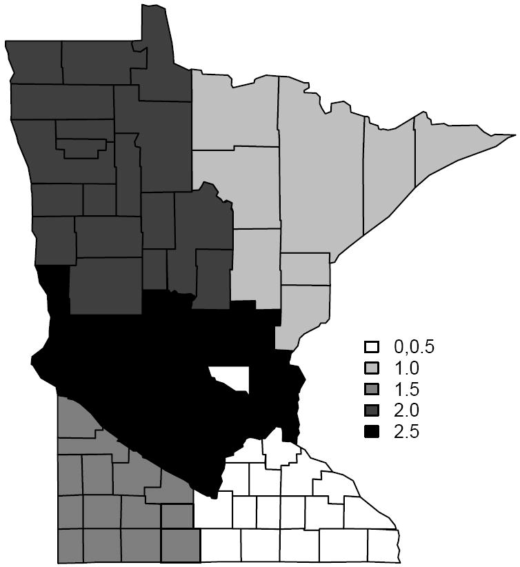
Figure 1.

A map of the simulated data with the grey-scales showing the six different clusters, each having its own mean. Two of the clusters are shaded white with the one in the interior comprising a single county (Sherburne) and has mean 0, while the other has a mean of 0.5. There are 47 boundary segments that separate regions with different means (shades).
