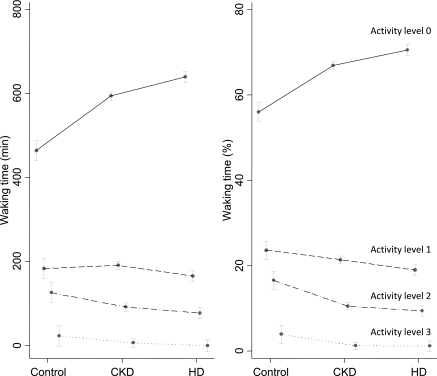
Figure 1.
The figure shows the levels of day-time activity by patient group. The raw minutes spent in each activity are shown on the left, and percentages are shown on the right. These values are adjusted for age, sex, race, body mass index, diabetes, and cardiovascular disease. The solid line represents the activity level of zero or rest; the dotted lines show increasing levels of activity. For both graphs (waking minutes and percentages of waking minutes), there was a significant group × activity level interaction (P < 0.0001). In other words, patients with CKD tended to rest more and were less physically active compared with controls. Patients on hemodialysis were the least physically active.

